A brand designed to fulfill employee potential
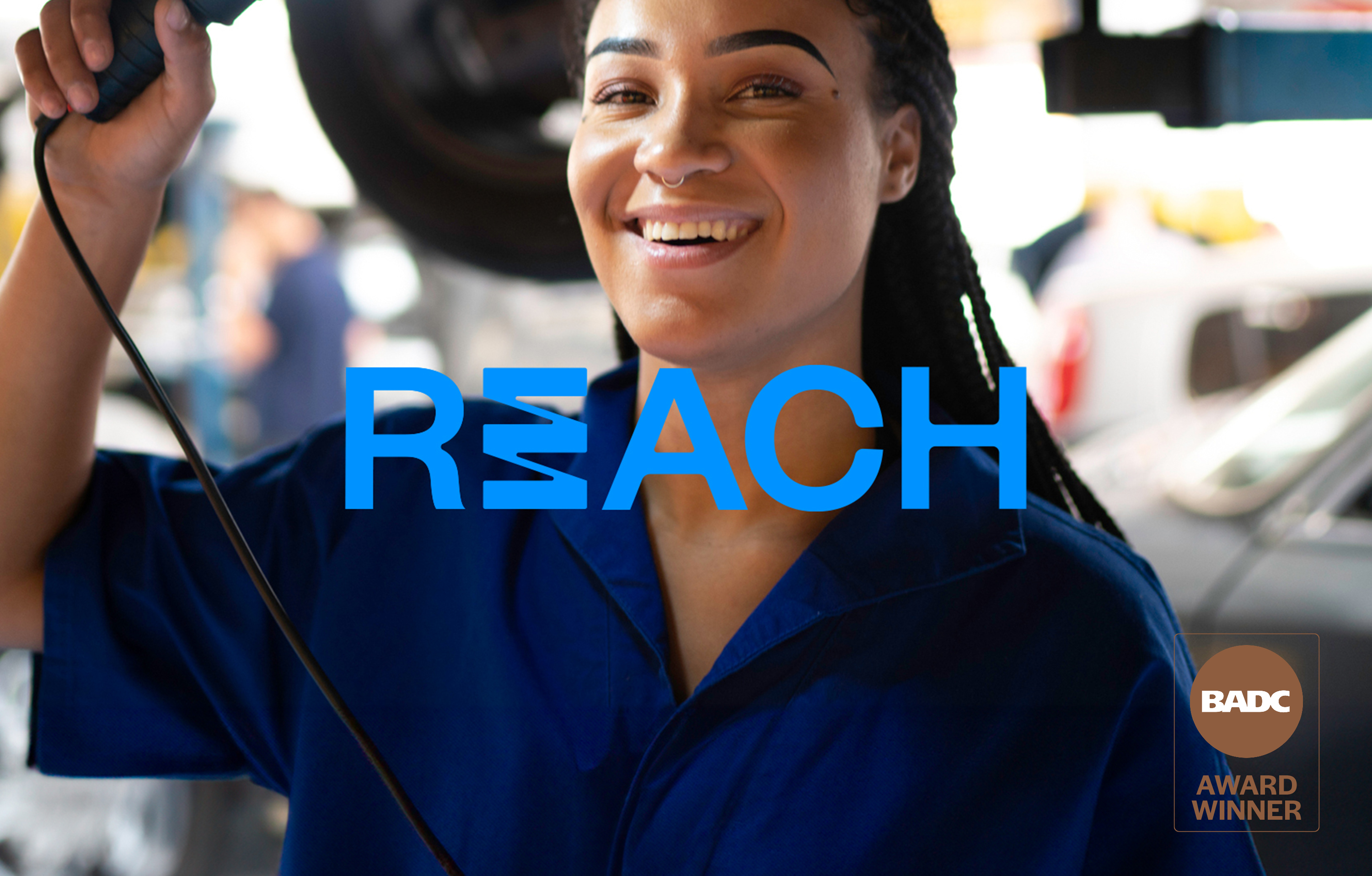
Sometimes projects morph and expand as they go along. This project for Sime was a good example. It started as a purely internal employee project to encourage employees to share their goals from both work and life perspectives so Sime could help them achieve their aspirations. As the project proceeded, it became a new branding exercise and ultimately was seen as a mechanism that could be used externally as well as internally. The creation of the REACH brand was quite the story. Bronze Winner of Best Logo Design at Brisbane Design and Advertising (BADC) Awards 2024.
Challenge
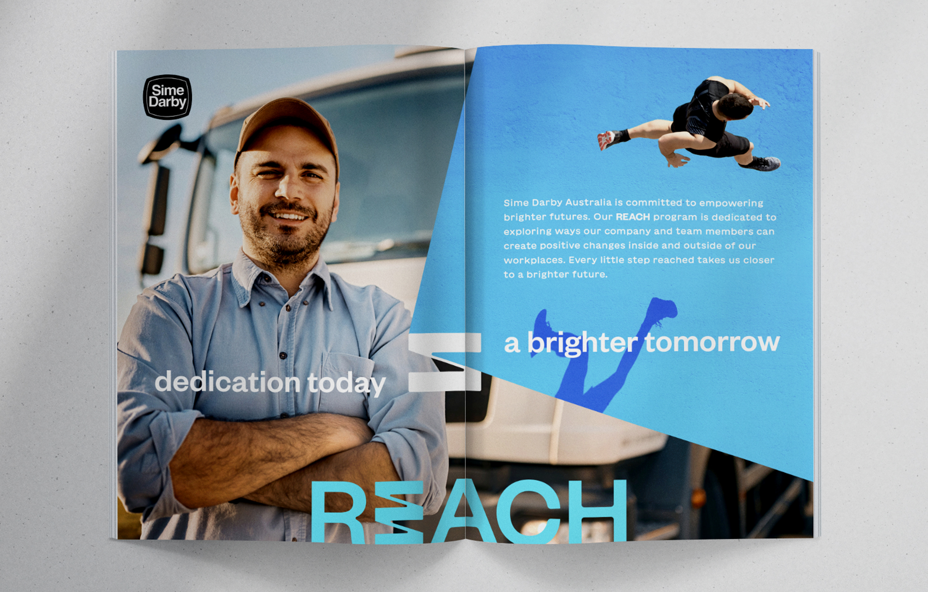
As a large corporate entity, Sime had fully developed brand strategies that naturally shaped all aspects of branding. The key brand purpose adopted by the company was ‘creating brighter futures’. That purpose formed for central pillar of this project. Our role was to show how ‘creating brighter futures’ could manifest in different ways for the Sime workforce. The challenge was to encapsulate a whole range of different aspirations and perspectives across a wide and varied workforce, while positioning Sime as a work culture that was positive, inclusive and encouraging.
The spark
Strategically, we worked in highly intentional stages with the client to build robust platforms for the project and new brand. The corporate branding work was analysed and interrogated to ensure we understood how this project would fit into an overall brand hierarchy and brand culture. We then set out to explore brand territories that reflected the different styles and direction the brand could take. The client considered the relative benefits and rationales of each territory before we went into a naming process. This strategy approach provided a strong foundational base for the final creative work.
Creative
Reach for a better future.
After the creative territories work unearthed a preferred direction, we began a brand naming process. A clear winner among a number of options was the name REACH. This name was regarded to fit perfectly within the overall brand purpose of ‘creating better futures’ and be the type of active descriptor that would engage current and prospective employees. It spoke to aspiration and fulfilment. The client also felt the name would work positively in corporate culture programs so it was seen to have a life beyond just an internal employee brand.
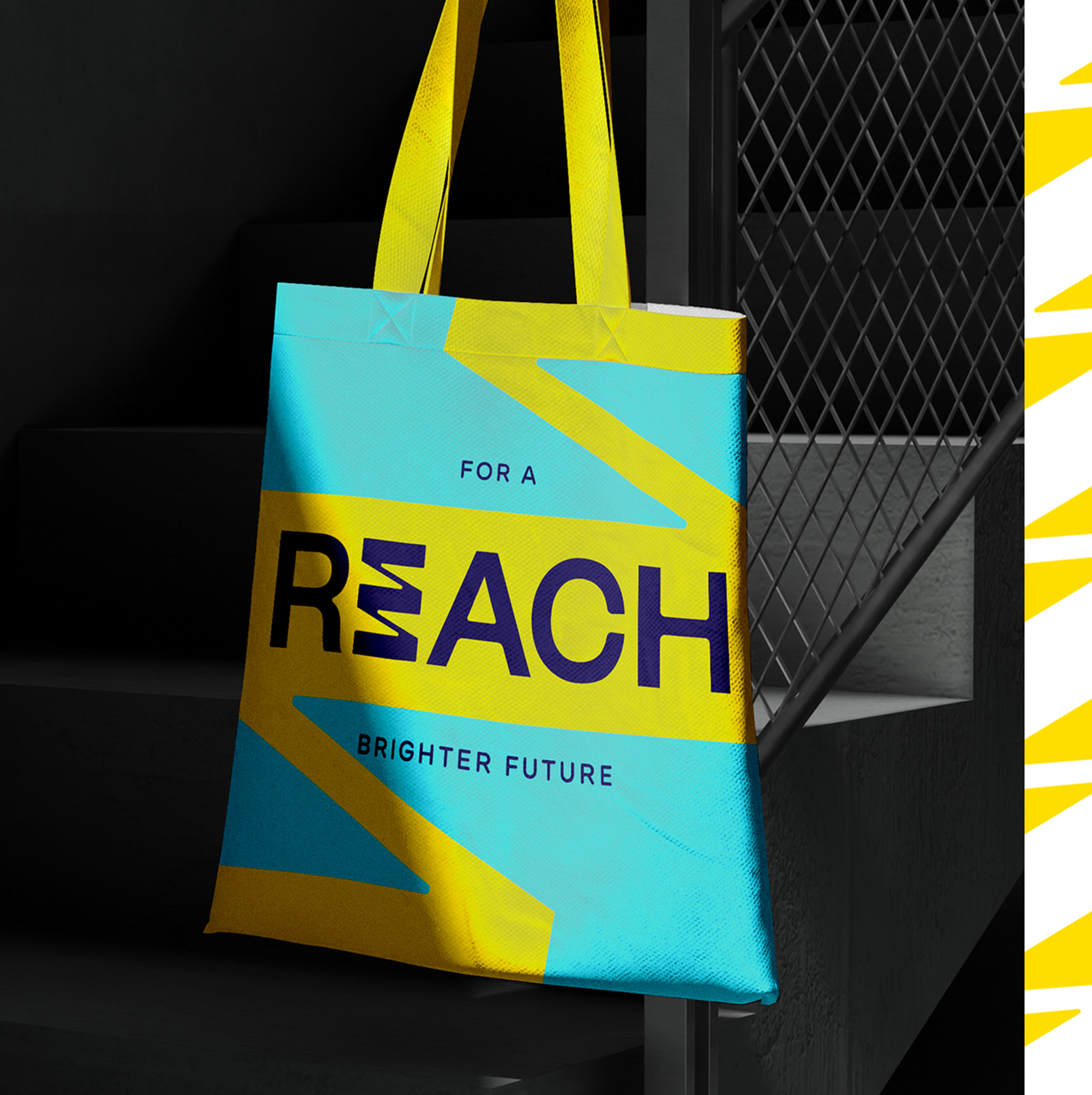
With REACH chosen as the name, our creative team went to work on identity visuals. A range of styles was presented, with a clear winner emerging early. It featured the work REACH with a spring-like icon in place of the E. The tagline came straight from the brand purpose … ‘REACH for a better future’. As a statement, it achieved everything asked from the initial brief. We created a brand guide for REACH including colour palettes, photography style, typographic treatment and icon usage. The brand has potential to be utilised across various communications and the client can use the guide to build equity and consistency in the brand.

Outcome
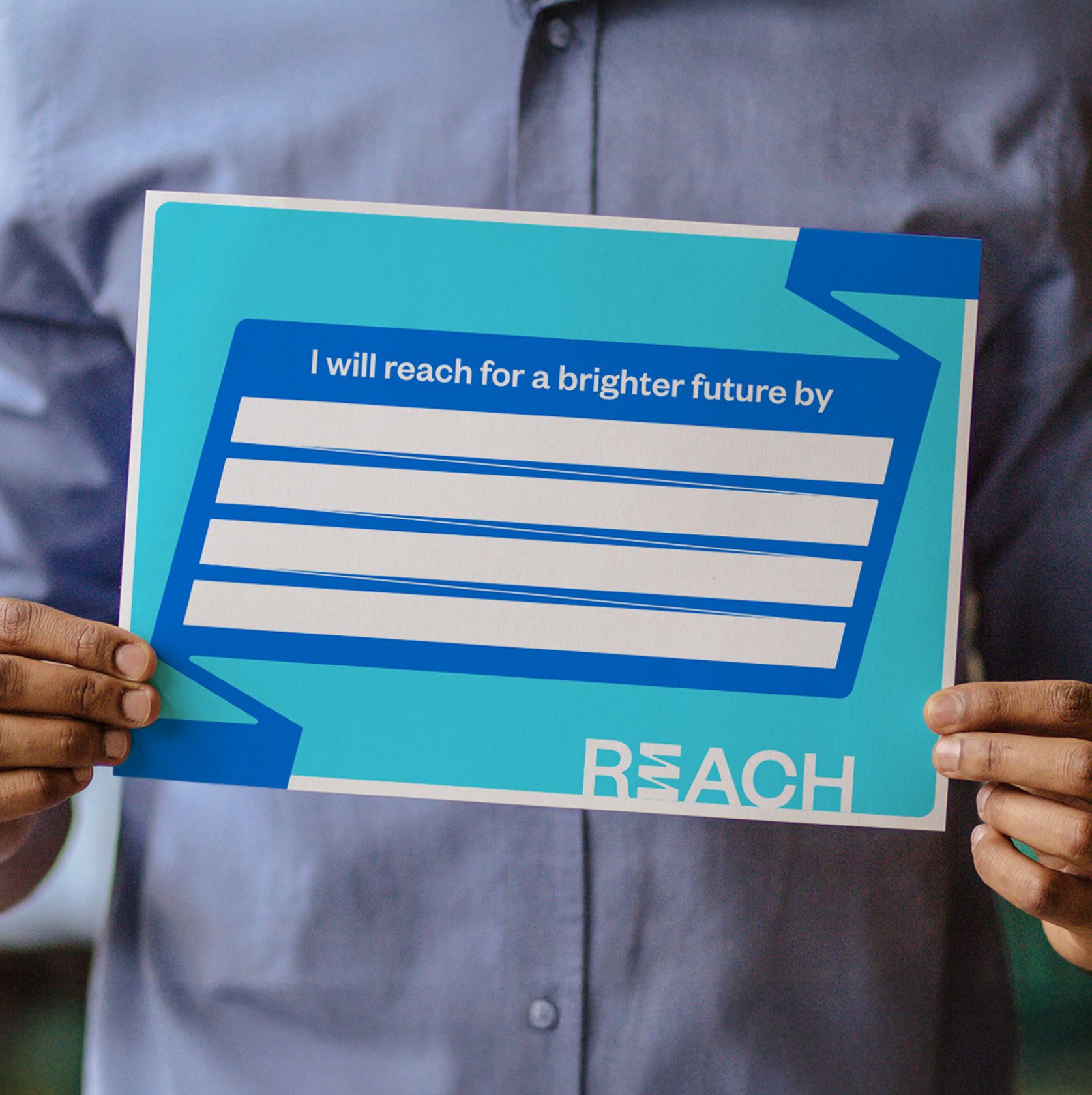
Within months of creation, the brand created immediate impact by winning a medal in the Brisbane Advertising and Design (BADC) Awards of 2024. It was testament to the creative process of the Sime and NWO teams that an ‘internal employee brand’ could win such a prestigious award. The rollout of REACH continues within Sime and the workforce. Practical measures such as REACH pledges are now instituted across the company and management teams are expected to work with the teams to help everyone REACH their personal and life goals in more flexible ways.